Services
UI/UX design
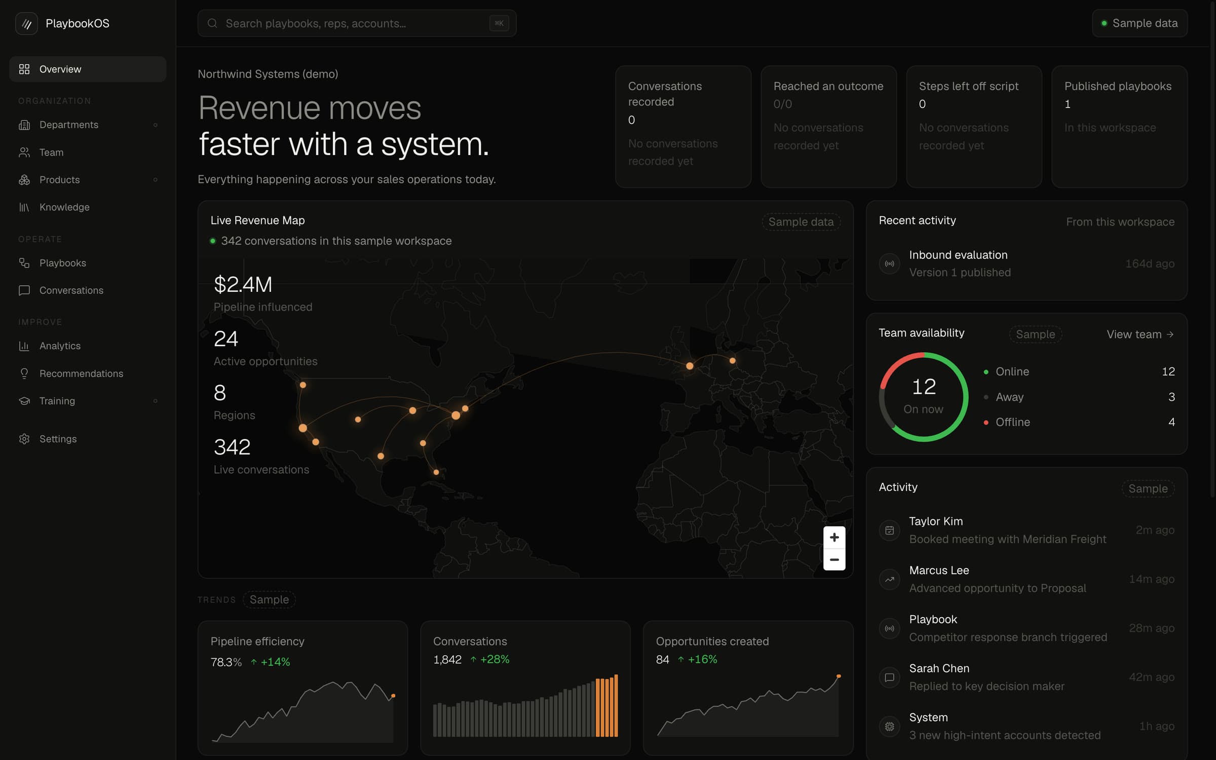
Interfaces and design systems with clarity, hierarchy and restraint.
The problem
Most interfaces are not ugly; they are unclear. Six things compete for the first look, the important action is the same size as the unimportant one, the text explains the company instead of helping the visitor, and every screen was designed on its own so nothing matches. The visitor does not complain. They leave.
What we do
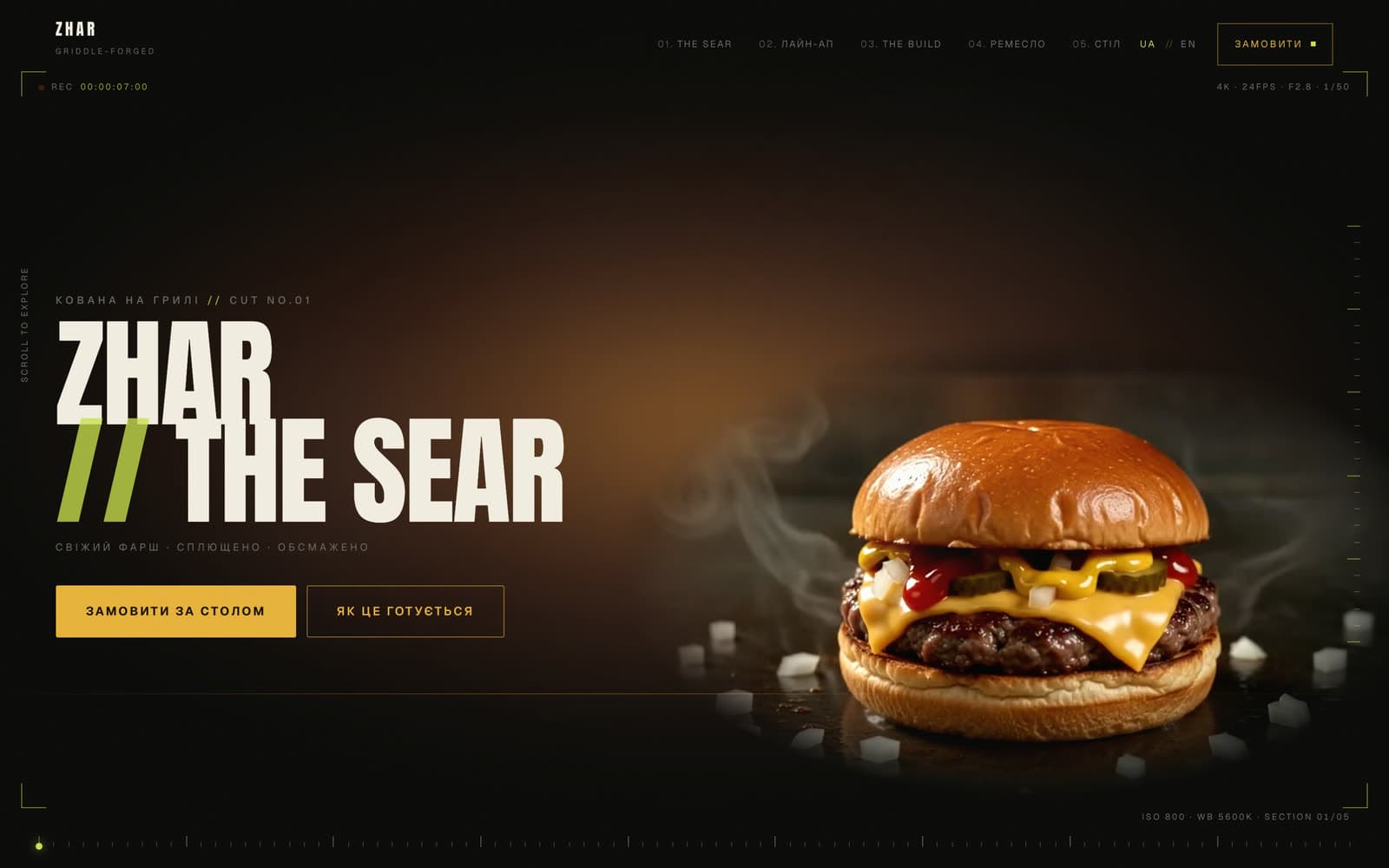
We design for the decision the visitor is making. Hierarchy first: what they see, then what they do. One type scale, a small palette, a component library, and the documentation that keeps them consistent when more than one person builds. For products, the unglamorous screens get the same care as the landing page. The VELMORA BEFORE & AFTER series is this work shown in public: an existing site, what holds it back, and the redesign — with the reasoning on screen.
Who it is for
- Businesses whose site or product looks fine and converts badly
- Teams that need a design system before the third developer joins
- Founders launching a product whose screens have to be trusted
- Anyone who wants to see the reasoning, not just the mock-up
What you get
- An audit of the current interface with the reasons, not just the verdicts
- Structure, hierarchy and copy direction for each key screen
- A design system: type, colour, spacing, components, documentation
- Production-ready screens, reviewed on a phone first
- A redesign concept when the question is "what could this be"
How the work runs
- 01
Watch how the current interface is used, and where it is abandoned
- 02
Decide the one thing each screen is for
- 03
Set the system: type, colour, spacing, components
- 04
Design the key screens, phone first, then the rest
- 05
Document, hand over, and check the build against the design